Component · controls (floating)
Liquid glass tab bar
Primary mobile navigation.
Also called bottom navigation, bottom nav, tabbar
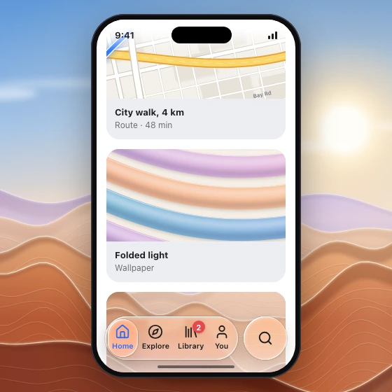
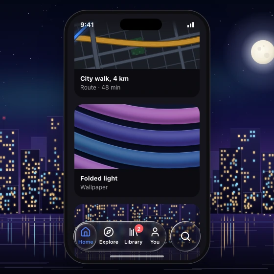
Spec
- Material
- regular
- Profile
- squircle
- Geometry
- floating capsule 56–64 tall, 8–16 above the bottom safe area, inset 16–24 from sides; items icon 22–24 + label 10–11; a separate circular lens for the one prominent tab (search by default, or the main action), same height, at the trailing end with 8–12 gap
- Bezel (px)
- bar 20–24 · selected pill h/2
- Displacement (px)
- bar 40–45 · selected pill 0.9–1.3 × its bezel
- Blur (px)
- 2–6
Anatomy
- glass capsule
- 3–5 flat items
- selected item: lighter lens pill inset 4 px, concentric radius, accent-coloured icon/label — the moving indicator, the one lens allowed inside the bar (composition rule 3); other items stay flat
- badges: solid red capsule 16 px
States
- rest
- selected
- press
- scrolled: may minimise to a smaller capsule
Rules
- Content scrolls under it; apply a scroll-edge fade under the bar.
- Never full-width edge-to-edge flush bar; it floats.
- Search (or the one prominent tab) lives in its own lens, not inside the bar, and stays visible when the bar shrinks on scroll.
- The selected item reads at a glance: its lens pill plus icon and label in the accent colour at full opacity; the others stay primary text colour.