Component · overlay

Liquid glass popover

Rich floating panel anchored to a trigger.

Also called preview card, hover card, flyout

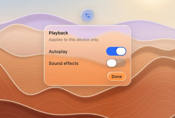
A playback settings popover below a round icon trigger, with two switches and a small confirmation capsule, over zoomed desert ridges.
A playback settings popover below a round icon trigger, with two switches and a small confirmation capsule, over zoomed desert ridges. (light)
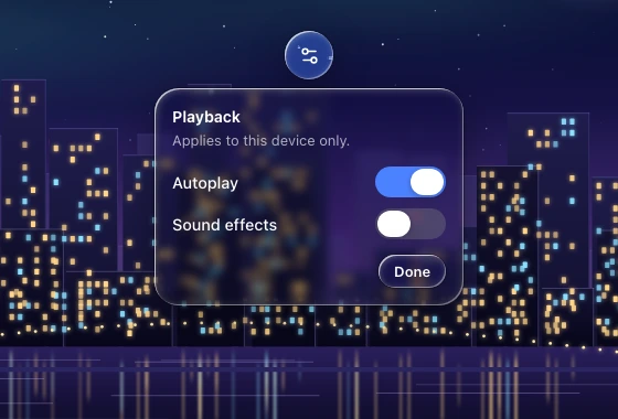
A playback settings popover below a round icon trigger, with two switches and a small confirmation capsule, over a zoomed night skyline.
A playback settings popover below a round icon trigger, with two switches and a small confirmation capsule, over a zoomed night skyline. (dark)

Spec

Material
regular (clearest overlay; strong bend at the rim)
Profile
squircle
Geometry
radius 20–24, width 240–320, padding 16, optional arrow
Bezel (px)
22–24
Displacement (px)
50–60
Blur (px)
2–6

Anatomy

  • glass panel
  • title 14 semibold + secondary description
  • flat rows with switches
  • small glass Done button bottom-right

States

  • closed
  • open from trigger

Rules

  • 6–8 px from the trigger.
  • Non-modal: no dim layer.